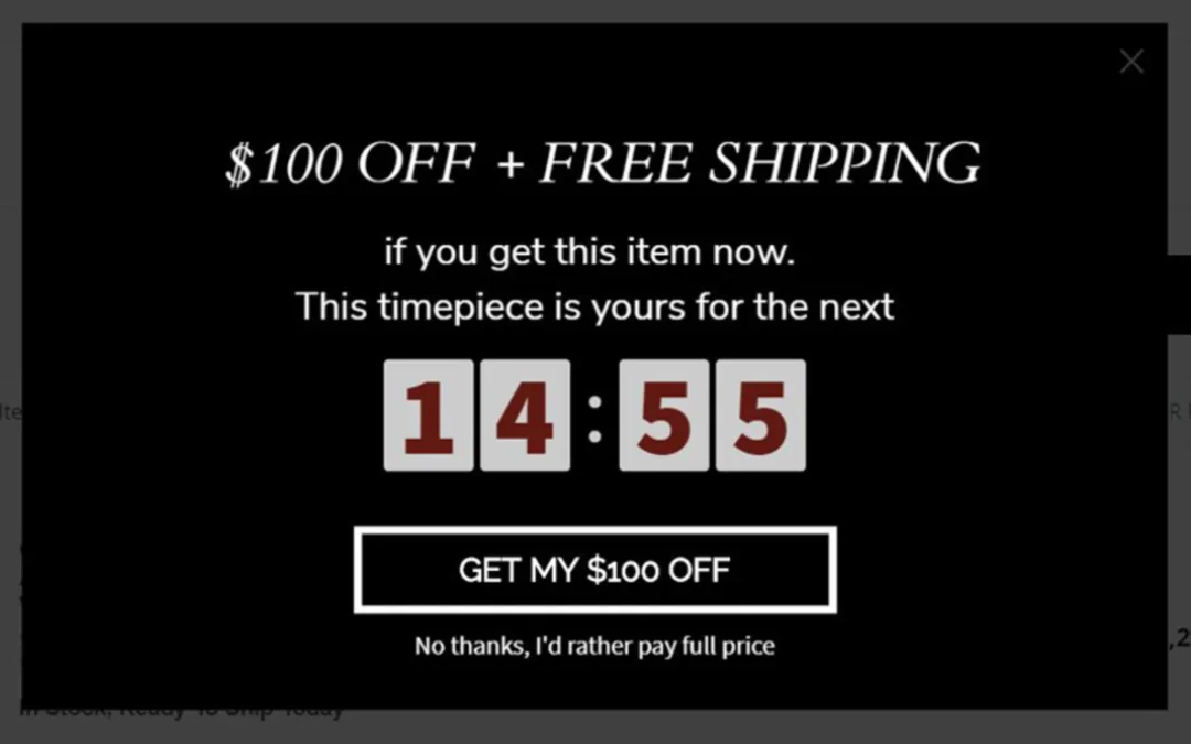
Offering discounts on your products can be a great way to boost your business sales, attract new customers, and move old stock.
Popups are among the most popular tools for offering discounts. They have an unparalleled capability to draw visitors’ attention to offers and convince them to become buyers.
Nonetheless, a high-performing discount modal is more than just a lightbox invading your user’s screen. It’s an opportunity to create a hard-to-refuse offer and show it to the right people.
Today, we’ll dive deep into how to use discount popups to drive conversions. We’ll highlight some outstanding popups and show you why they work. We’ll also cover:
- Distinct features of a high-performing discount popup
- How to use data to create highly converting popups
- Why it’s a great choice to offer free shipping to customers
- How the design of a popup impacts its performance
Do Discount Popups Work?
Love them or hate them, popups work.
In fact latest studies show that the average conversion rate for a popup is 11.09%. To give you the context of what we mean, this percentage translates to 112 conversions for every 1000 visitors who come across your popup.
In ecommerce, popups come in handy as tools to boost conversions. You can use them to promote discount codes to first-timers, grow your email list, and even entice shoppers to complete the order just before they abandon a cart.

What Makes a Great Discount Popup
Discount popups help to increase business revenue and keep customers engaged. As a result, they fulfil the primary goal of ecommerce—encouraging people to buy your products.
Here’s what makes an excellent discount popup.
- A great popup design has fewer distractions
- Concise and persuasive copy
- A clear call to action
- Mobile friendly
- The best location and appearance time
- Complements well with your brand
Now, let’s look at some discount popup examples and see why they perform well.
1 – Exclusive Discount Popups
People love discounts. One study shows that about 80% of consumers surveyed admit they’d try a new brand if it offered them a discount. To encourage your customers to buy your products you can use discount popups and an email list.
A brand like West Paw has mastered the art of offering discounts on their products using popups. Just take a look at their discount modal below.

They’ve incentivized the popup to build their email list. Instead of displaying the coupon code on the popup, customers will have to sign up to their email list to get the discount. This means only an exclusive group of their audience will access the offer—their new email subscribers.
Their design is simple and they’ve used a color that’s optimized for higher conversions. Blue evokes a feeling of trust, and orange brings on the urgency.
Another online store taking advantage of the exclusive discount popups is Adidas. They’re also aware that a discount may not be enough to convince users to sign up for their promotional emails.
That’s why they make it super clear that you’ll receive a discount when you join their club.

But do you notice how they use the word club instead of a newsletter. That’s to avoid being salesy. The word “club” gives users a sense of belonging. That way, they’ll feel like they’re part of something big, yes, a big brand.
So even if the new subscribers do not instantly become customers, Adidas can nurture them with unique offers and personalized email campaigns and encourage them to buy.
2 – Free Shipping Popups
We bet you’ve been in this scenario. You add an item to your cart with an intention to complete the purchase. But when checking out you find extra expenses like shipping fees, taxes and transaction fees added to your order. It’s annoying.
And we won’t blame you for hitting the back arrow like the other 48% of online buyers who abandon the cart because of high extra costs.
While you can’t do much about taxes, you can avoid other unexpected expenses like shipping fees to encourage customers to complete the purchase.
Enter free shipping discount popups.
Including free shipping as part of your discount popups is a smart strategy that’ll not only grab visitors’ attention but will also raise the ultimate purchase quantity by your customers.
Usually, buyers are more inclined to toss in anything extra (that’s a win for you) if they need to achieve a particular price point to qualify for free delivery. One research shows that 75% of consumers surveyed expect free delivery even on orders below $50.
Let’s look at some examples of discount popups employing the free shipping strategy.
This popup from Outdoor Research does a great job in achieving that.

This popup performs well for at least four reasons:
- A minimalistic design that minimizes distractions
- The clear headline and subheadline concentrating on the value you’ll get, which is free shipping, exclusive deals, and notifications on new releases
- Just one input field allowing you to sign up using just your email address
- Enticing call to action (CTA) that lures customers to activate the free shipping offer
Expert Tip: To optimize these types of discount popups we would advise you to create different popups personalized for each stage of your customer’s conversion path.
For example, if your ideal buyer is new to the website you can use the email input field to attract them to signup for your email list just like in the popup above. If the customer on the other hand has already bought your products you can entice them with a free coupon code that guarantees them free shipping encouraging them to make a purchase.
3 – Limited Time Offer Discount Popups
These types of popups are designed to create a sense of urgency. They also trigger the fear of missing out (FOMO).
Basically, humans are drawn to things that are scarce in supply. And when you employ the same strategy for your popups, more customers will feel compelled to buy your products if they believe they are in on a once-in-a-lifetime offer.
Consider this small floating header popup from Duckworth.

It looks simple but let us show you why it works.
Firstly, it creates a sense of urgency using the countdown timer. The timer creates an instant desire for customers to grab the offer by showing them they have limited time to do so.
Secondly, the offer is compelling enough. It’s hard to get a product being offered at a massive 30% discount. So literally, the whole countdown timer thing makes sense to visitors.
Lastly, the popup is located on the visible region on the website—above the fold. It’s hard for the popup to get ignored, considering it hardly distracts them.
The table below summarizes key examples of limited time offers and why each tactic works.
4 – First Order Popups
Introductory discounts allow you to optimize your customer acquisition process by building customer awareness and interest.
You’ll agree that convincing new visitors to make their first order is not a simple task. They’re unaware of who you are and still wonder if they should trust you yet. To give them a gentle push, you can dangle a good deal so that they can make their first order.
Take a look at the popup example below.

The popup’s headline is concise and straight to the point. It piques the customer’s interest by communicating a message that convinces them to make their first purchase.
The CTA message is super clear. It’s engineered to drive a specific action, “unlocking the offer”. Like any other high-performing ecommerce popup, it avoids CTAs like “subscribe” and “get started” that create a commitment and promotional notion.
The design of the popup is classic yet simple. It complements well with the website’s design. They followed the best practices in using the best colors in their CTA button with the right emotions.
Blue intrigues a feeling of trustworthiness. Considering that this is a skincare brand, customers will buy the best product they can trust with their skin.
Here’s another outstanding popup from Montana Silversmiths.

The popup is tailored for first-time buyers since the company knows that they’re not subscribed to their email list. And since it’s a matter of seconds before these customers change their mind and bounce back, they’re hit with this discount popup to entice them to make an order.
But let’s face it, not all customers are equal. One visitor may visit your website for the first time, but another is a frequent consumer. So creating discount popups personalized for each of them can be hard. It would help if you had data and frequent A/B testing.
Here’s where we step in to save the day. At Tadpull, we help you drive ecommerce store conversions using data science. Our software, Pond, enables you to optimize traffic acquisition channels and use the data to create highly converting popups that match the right offer to the right customer.
“We see 2–4x improvement in month over month revenue by using the Tadpull Pond software.” Rich Hohne, Director of Brand and Consumer Experience, Oboz Footwear
Create a High-Converting Discount Popup
Discounts have an impact on how consumers connect with your products and brand in ways that go beyond merely appealing to the concept of saving money. It boosts brand awareness and builds customer loyalty.
When used properly, shown to the right audience, and thoroughly tested for higher performance a discount popup can help you to turn a leaving website visitor into a customer.
However, to optimize your popups for higher conversions you need data and the right technology. This is where Tadpull Pond software comes in as an invaluable tool.
Using our technology you can leverage data and maximize your ecommerce business performance against new and existing audiences.
Our powerful analytics and artificial intelligence (AI) will help you build personalized experiences back into paid and email campaigns to boost profit. Book a meeting with our growth expert and let us help you boost your business revenue.

